Many of its core clients that had been with the firm for over 30 years were lost to competition from larger multinational firms setting up in the country.
New client acquisition had slowed down drastically with majority of the current clients unwilling to work with anyone other than the founder they had grown to trust.
Objective
– Reactivate former clients – Increase revenue from current clients – Better connect with new clients
Execution
We started with an audit, looking at all other parts of the business that would need to be adjusted to make the rebrand effective.
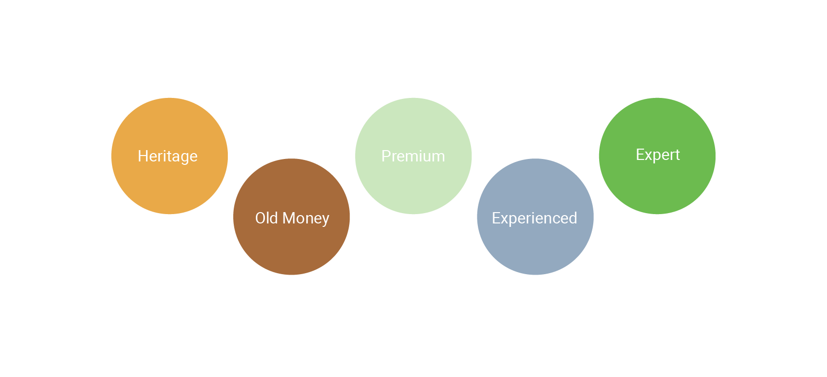
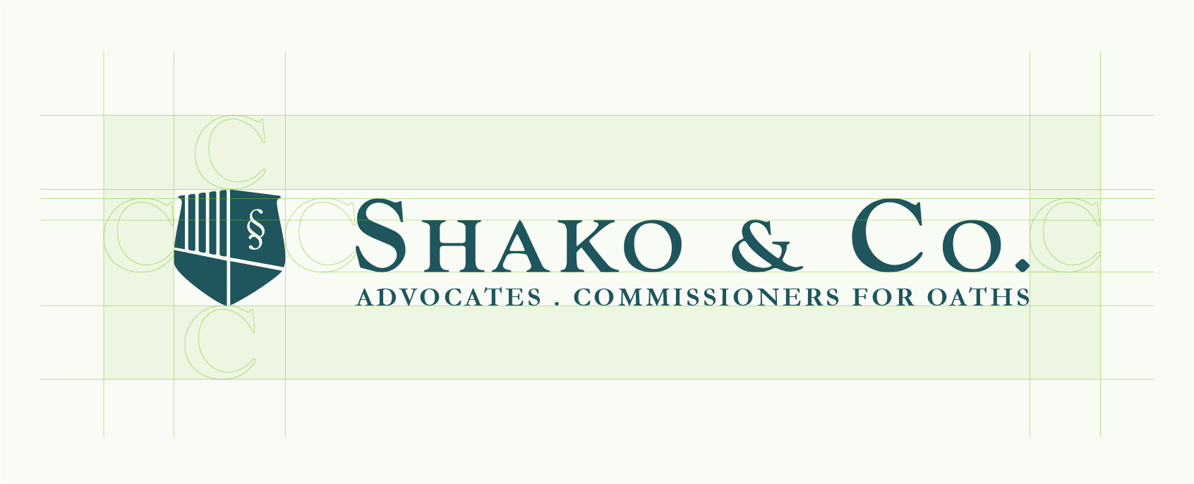
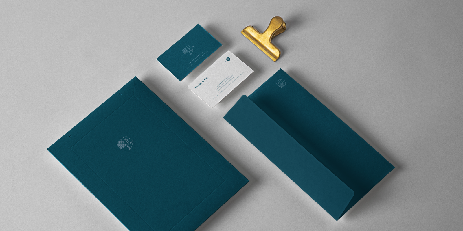
We developed a visual identity meant to reflect their current clients status and sophistication while appealing to new clients as an experienced and trustworthy partner. They felt the final brand mark properly captured their values and expertise in a balanced way.
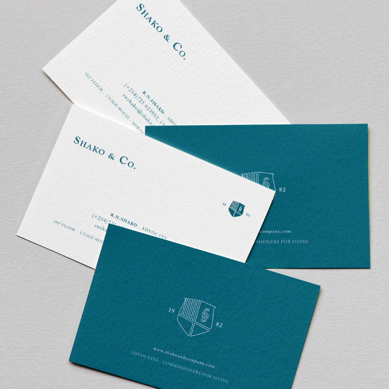
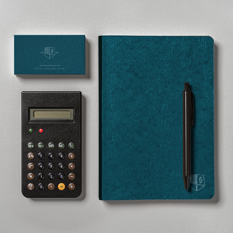
Aside from the visual identity, we worked together to improve the clients experience of handling their documents using paper stock with a unique, premium feel to reinforce the idea of quality in their minds.
Inspiration
Through the rebrand, Shako & Company wanted to present themselves as experts, with years of experience in the legal field and offering superior quality of services.
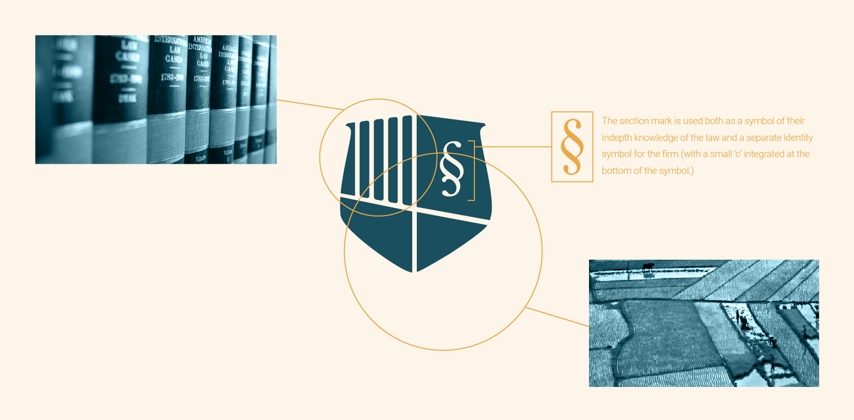
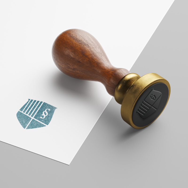
We started with a logo design that captured the most important aspects of the firm – their dedication to the rule of law, their focus on real-estate and their knowledge in the field.
Findings
While clients had been switching to newer and larger firms, they preferred the smaller local firms where they could get personalized services and at reasonable rates.
The rebranding process shed light on the history, strengths and competitive advantages of the firm that gave the whole the team a renewed sense of commitment and purpose to serve their clients better. It also exposed a few areas of the business where gaps existed which the Shako & Company team swiftly addressed.
Results
The rebrand was followed by an increase in the number of enquiries over the phone and walk in clients even without a launch campaign. The team was able to rekindle a significant number of key relationships with former clients and start working together again.
They were able to increase the average value of invoice by at least 30% and the frequency of sale per client also increased.
We started with a logo design that captured the most important aspects of the firm – their dedication to the rule of law, their focus on real-estate and their knowledge in the field.
Aside from the visual identity we worked together to improve the clients’ experience by choosing paper stock for stationery with a unique, premium feel to reinforce the idea of quality in their minds.