Helping a new tour company assert their difference.
Problem
Their challenge was entering an already saturated market distinctly divided into luxury versus budget service providers. Many tour operators used the same language and tone in their communication and used similar appearance in their branding.
Eco-tourism is often associated only with luxury travel. Akara needed to be a respectable eco-tourism company offering mid-tier rates to attract conservationists without losing philanthropists.
Objective
Find an African name that suits the company and the cause.
Differentiate the brand in the market with a distinctive identity.
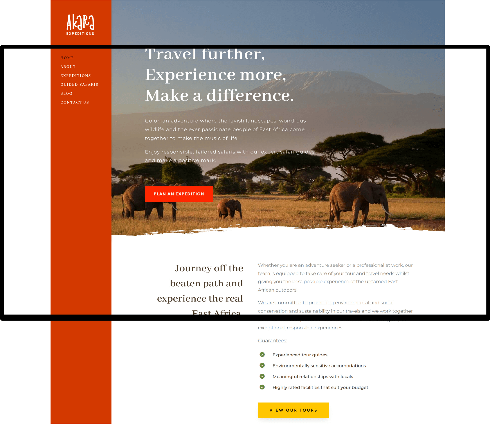
Automate some client interactions through a website.
Execution
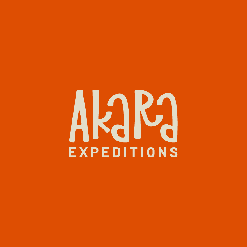
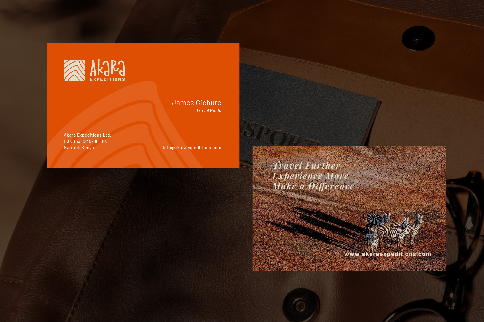
The project was on a tight timeline. The client needed an African name that can easily works across cultures. “Akara”, is Igbo (a West African tribe) for “imprint”. It captured their inclination towards sustainability impact.
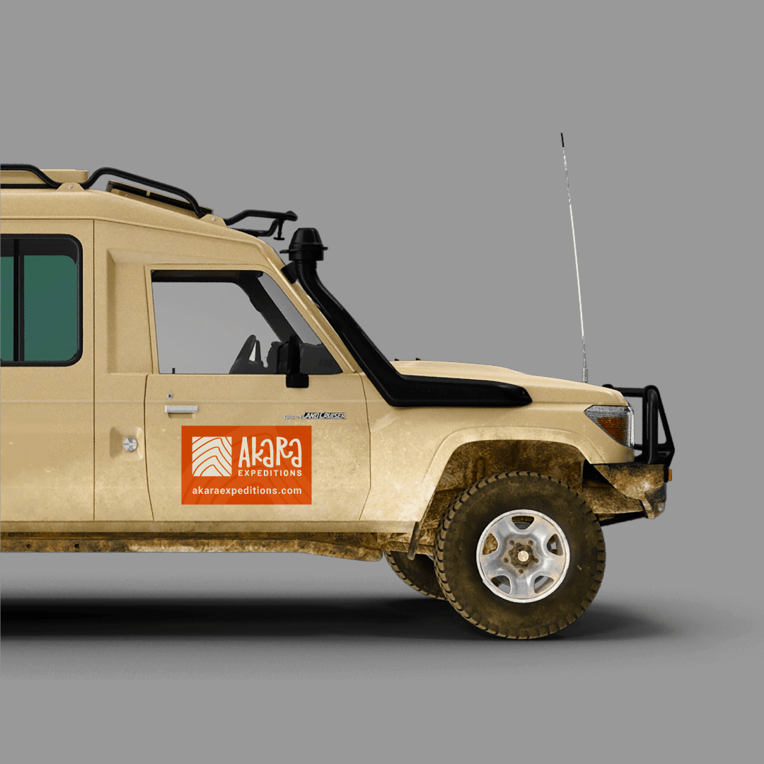
We quickly followed with an identity design taking into account that simplicity and distinctiveness was key. The client wanted a visual identity and communication that is clear and that presents them as a company providing a unique yet slightly sophisticated experience.
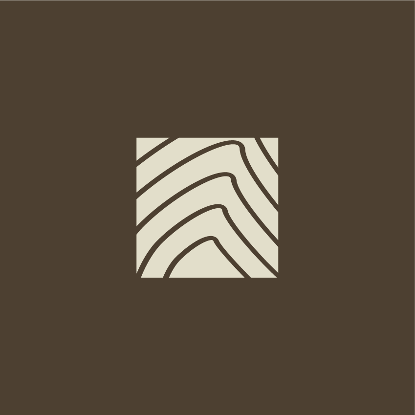
The logo would need to be a word mark with have a hand drawn, mud-sculpture feel to it while remaining a simple mark. It would be coupled with a modern icon expressing vibrance through a pattern symbolic of the East African landscape.
Inspiration
Akara wanted to offer an alternative to luxury tour operators, who basically owned the eco-tourism product in the market.
The name Akara would symbolize their passion for sustainable tourism practices where they urge their clients not only to consider that their tour activities leave an impact on the environment and the people, but also to deliberately leave a positive imprint as they go. The logo icon would be inspired by the East African landscape of mountains, plains and lakes and rivers all in a harmonious rhythm.
The choice between a “philanthropy” versus “community” style-board led to the community board being the favorite with some elements from the philanthropy board being chosen.
Application
Once the website design was complete and social channels and business listings updated with the new branding, it was time to for the client to take the first steps, which included contacting past clients to update them on the start of this exciting new company.
Results
The identity design produced iconic visuals that immediately sparked conversation. The client felt equipped to go out into the wild and make their mark. Akara Expeditions picked up almost immediately, landing a dream client, a research team documenting fauna across East Africa, within a short while. The company continues to grow with the founder at the helm.